Aditya Birla logo & Emailers
Challenge
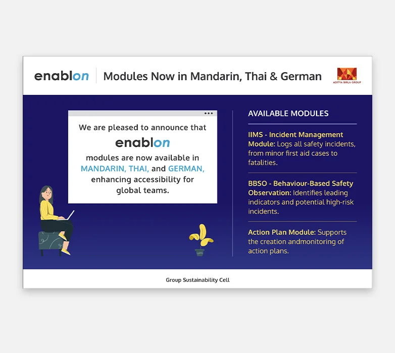
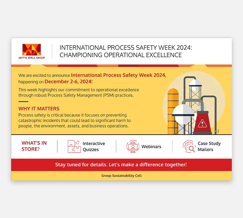
Aditya Birla’s sustainability cell required a clear and consistent visual identity to support Process Safety communication initiatives. The challenge was to design a logo and a series of emailers to communicate the importance of process safety effectively across a large, diverse organization while maintaining alignment with the Group’s brand standards.
Approach
We began by understanding the objectives of the Process Safety initiative and Aditya Birla Group’s brand guidelines. A dedicated logo was developed to create a distinct yet aligned visual identity for the initiative. This was complemented by a series of structured emailers designed for clarity, consistency, and high readability, ensuring key messages were communicated effectively across internal audiences.
Impact
- Strengthened visibility and recall of the Process Safety initiative
- Enabled clear and consistent communication across the organisation
- Maintained strong alignment with Aditya Birla Group's brand standards